
Klaviyo Email Builder
Redesign project
OVERVIEW
The email builder is a core feature of Klaviyo's platform, and users spend a significant amount of time using it. Despite its importance, the builder has not received significant updates since its original release in 2013.
The technology behind the original editor was preventing the team from releasing long-requested features and improving the editor's usability.
Our team embarked on a major modernization effort to update the technology under the hood and improve Klaviyo's email editor to meet users' expectations for web-based experiences.
ABOUT
Web email builder redesign
ROLE
User experience, user interface
TEAM
Product • Corrine Lin, Sean Walsh
Design • Gui Schmitt, Julie Lungaro, Sara Reich, Don Ton
Engineering • Vidhu Bhatnagar, Dillon Jones, Lindsey Curran, Nikita Shenkman, Daniel Kezerashvili, Chad Furman, Adrian Baker
CHALLENGES
THE PROBLEM
Backwards compatibility on all features
Modernizing a foundational tool such as our email builder required a functionality compromise.
In order to make the transition as smooth as possible for existing users, all features of the classic email editor needed to be supported on the new one.
Unfortunately, this decision deprioritized larger shifts in interaction, such as a WYSIWYG editing model and a mobile/responsive editing solution.
We encouraged users to create sophisticated automated sending strategies - specialized messages for different segments of an audience. For example, changing a message based on the cost of items left in a cart, or how frequent of a buyer someone was.
While strategizing this way provided great results, it created a lot of work in the future to maintain consistency across email messages.
Multi-year / teams project
The email builder redesign project spanned almost 3 years (2019 → 2022) with different PMs, engineers, and designers contributing to it (with me joining the team in late 2020).
However, due to team transitions and our organization still learning how to operate efficiently with larger teams, the context for some decisions of project was sometimes lost.
Most easily accessible resources on mobile UX patterns provide a catalog approach, showcasing examples of patterns with little to no contextual information on their strengths, best uses, and weaknesses. The tool should provide users with enough relevant context to make informed design decisions, regardless of their expertise.
Goals
Improve usability and efficiency
Any gains in productivity in the email editor can pay dividends for all future content creation by the user.
Our goal was to enable users to compose emails quickly while also providing ample opportunity for brand expression.
Align the email editor with our build-as-we-go design system
As our design team grew and became more structured, we built our design system to ensure consistency across the platform.
The new email builder needed to behave consistently with other recently released content editors, such as the Forms editor and the SMS editor.
Process
Background
In late 2020, I took over the design of the email editor update project.
The project aimed to update content blocks within an existing editor structure that was inspired by recent modernizations of our Forms and the introduction of our SMS editor, which I was responsible for.
Working with our product team, I identified areas for improvement in each remaining content block, as well as the Preview and Test experience.
This process was based on customer feedback collected over the years, as well as an analysis of the competitive landscape and other best-in-class web-based content creation experiences.
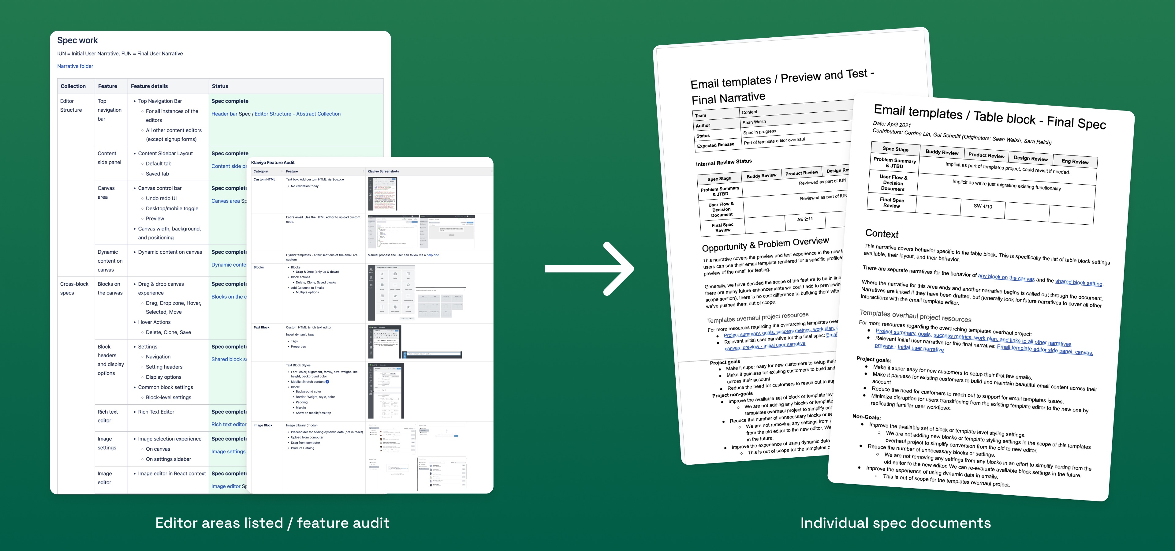
For each of those areas, I began by creating an exploration page on Figma.
I experimented with solutions that would use established patterns within our system, as well as brand-new ones for areas of the builder that fell into the ideal quadrant of high usage and poor usability.
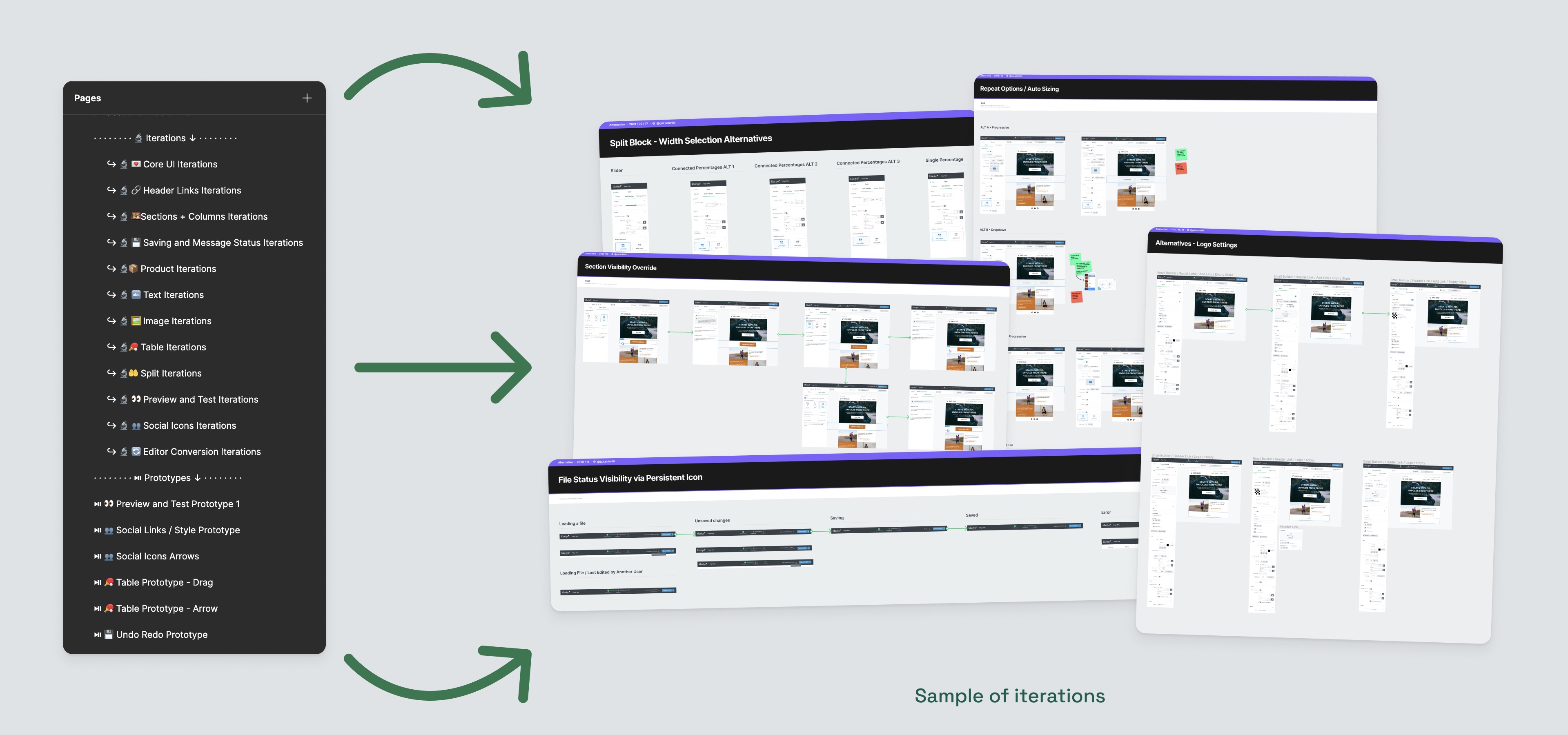
While each and every core area of the editor received improvements as part of the redesign, there were a couple of areas that I found to be the most significant wins in usability:
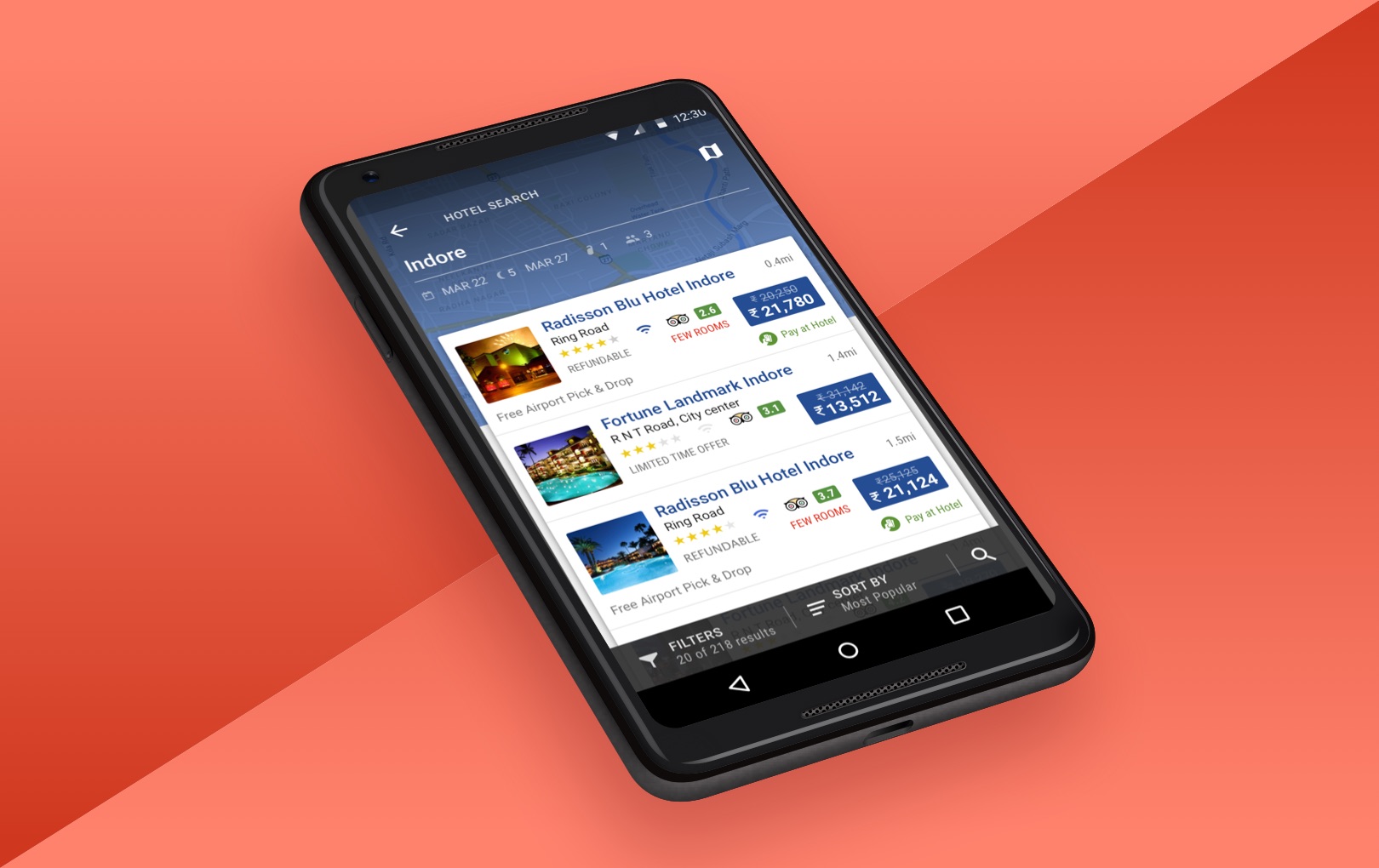
Seamless preview system
KEY FEATURE IMPROVEMENT
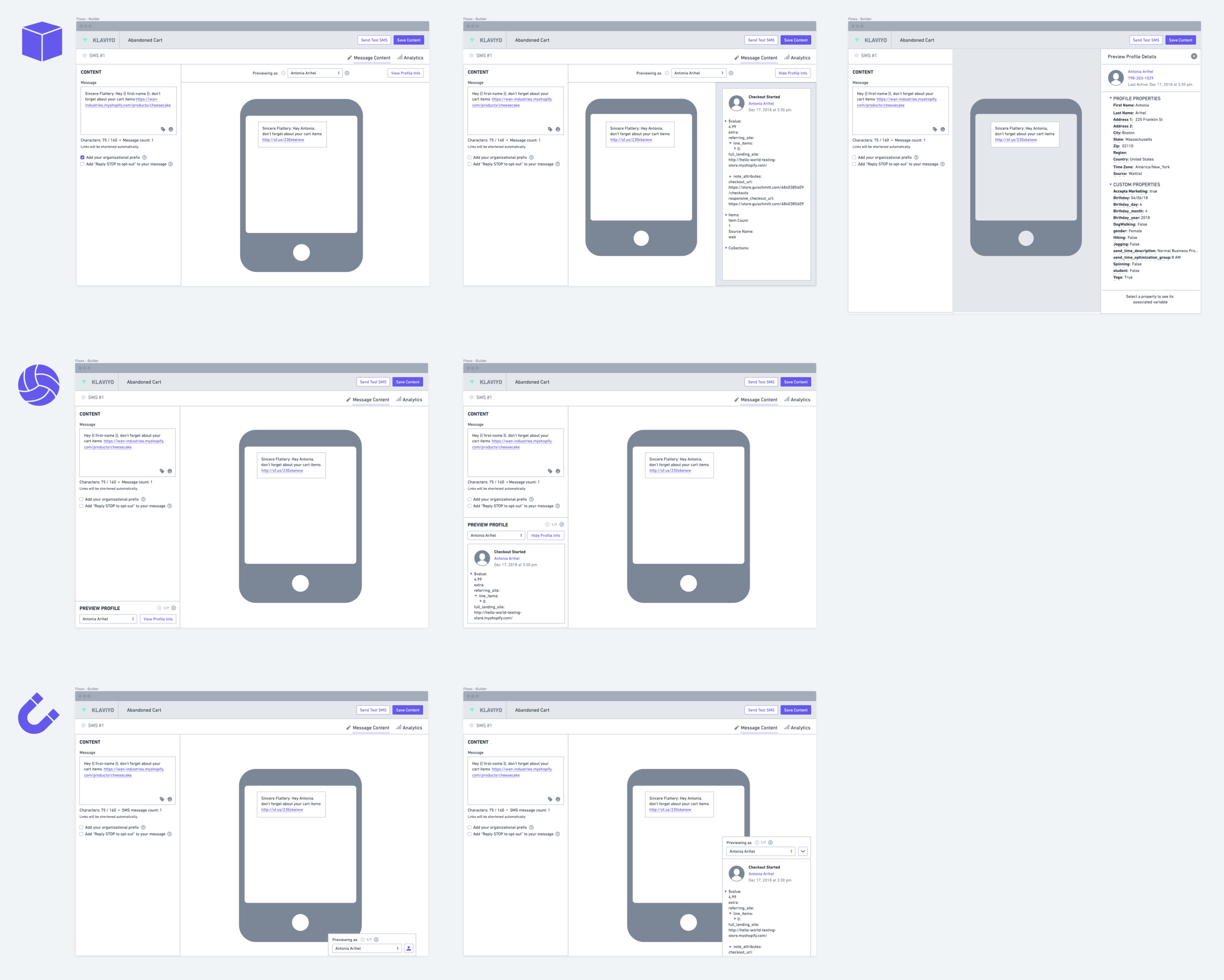
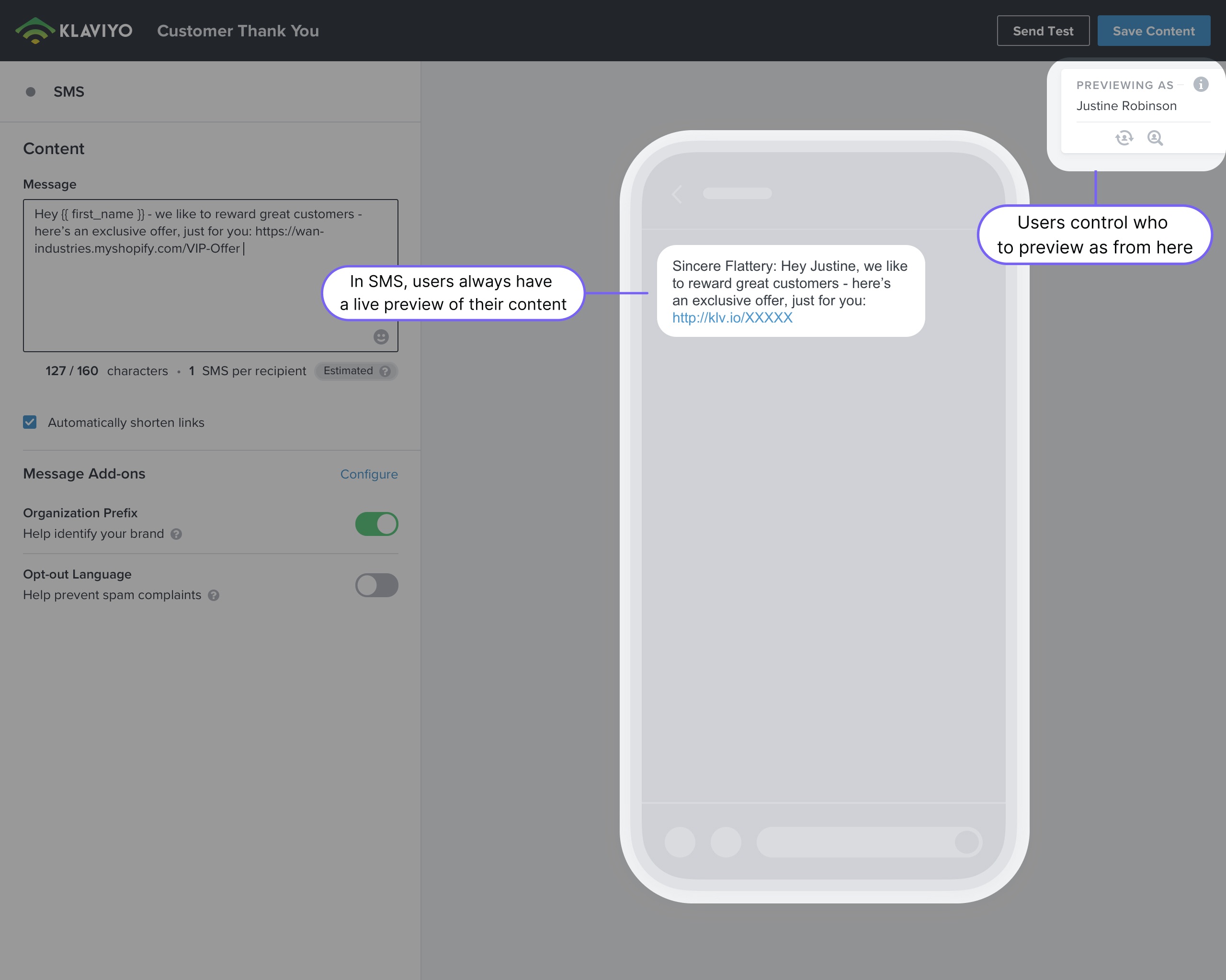
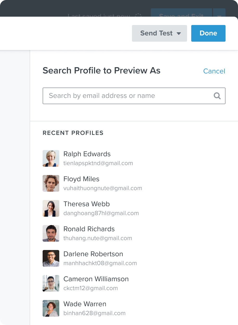
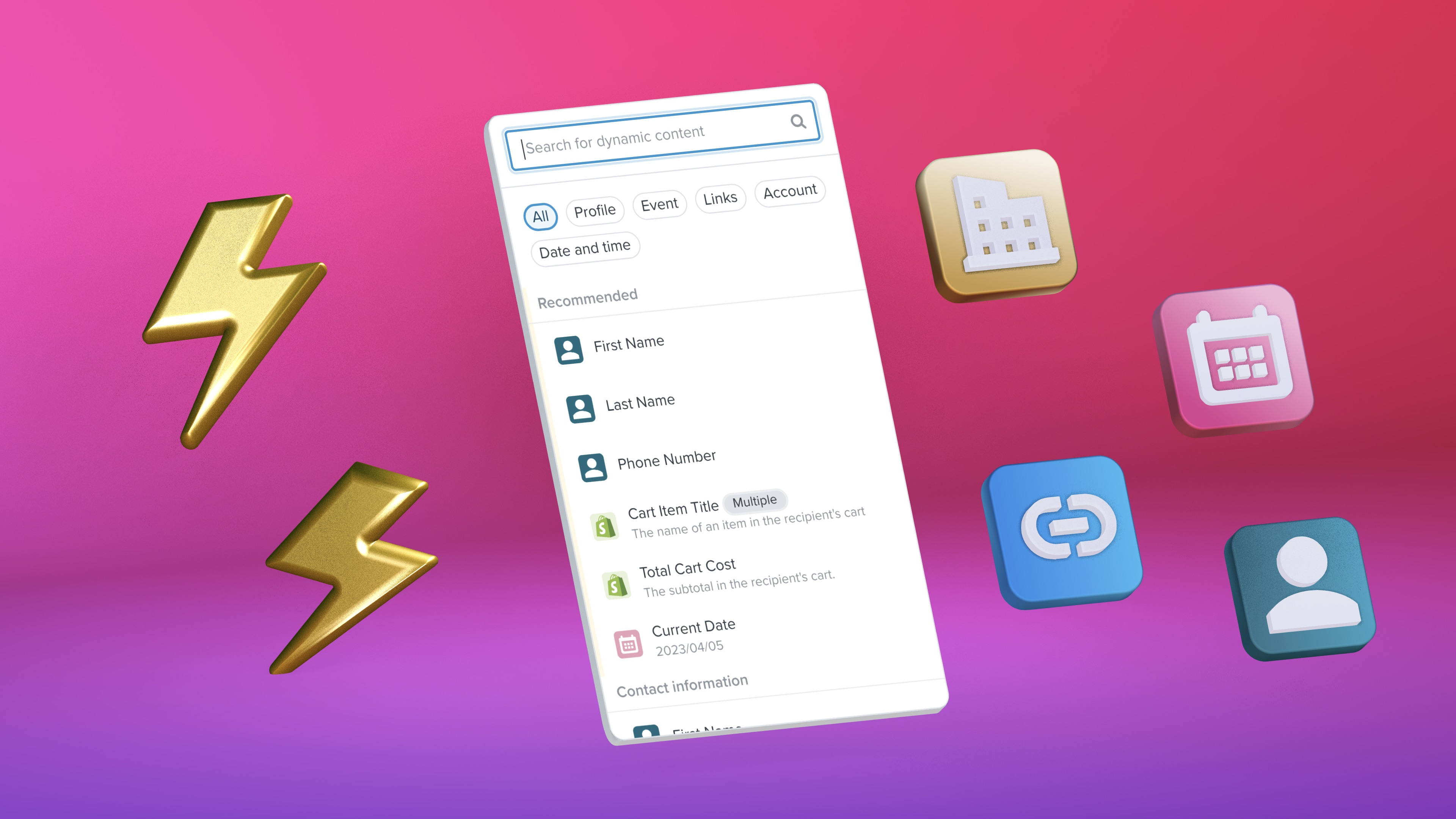
Users rely on email previews to validate dynamic data and ensure everything looks correct before sending.
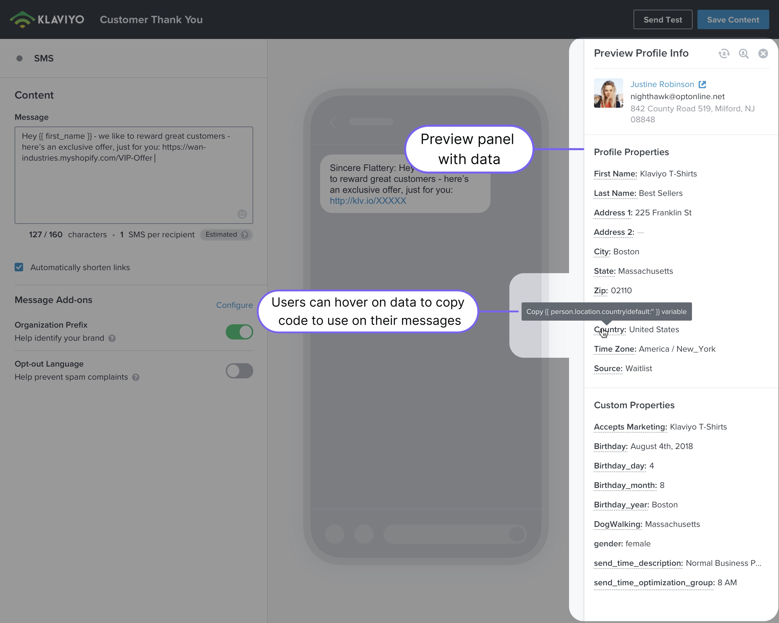
In Klaviyo, the preview panel was also used to show different types of dynamic data, such as information from recipients or events (like items in an abandoned cart), that users can utilize in their messages.
Original campaigns experience
One of the major drawbacks of the original preview experience was the need for users to select who would like to render the message as.
Original automation experience
For automated messages, users could use the modal to copy snippets of code they can use in their messages for personalization.
Despite its usefulness, the usability was poor, with most users not being aware of that capability.
SMS preview
The preview experience borrowed from our SMS editor work (which I was part of).
Users of SMS loved our always-visible preview, with the ability to easily cycle through different profiles to display for data validation.
Since email had a working canvas, we couldn't do just that. Instead, we opted to create a new full-screen overlay pattern that could use the user's screen in the most efficient way for the task of making sure their emails look great before sending.
New preview experience

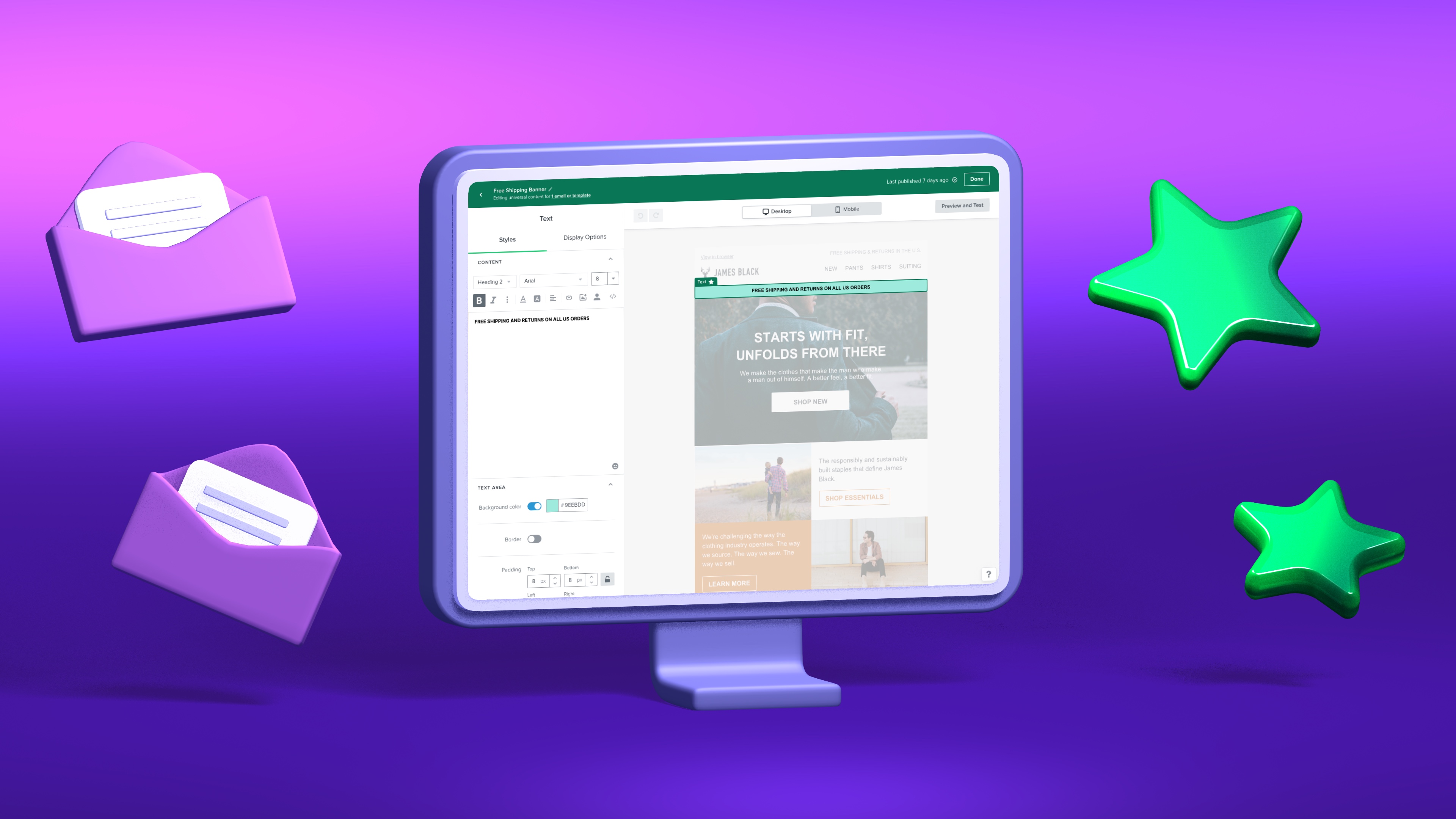
The new preview workflow is seamlessly integrated into the editor, appearing as a sheet sliding up from the bottom of the screen.

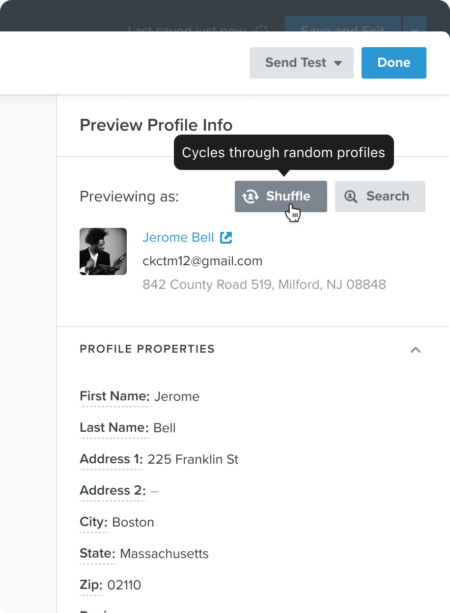
Users can efficiently cycle through multiple recipients or recent instances of an event (for example, people who added items to their cart but didn't complete checkout) to verify dynamic data.

Users can easily copy dynamic content snippets with a click and utilize keyboard shortcuts to bring the preview sheet into view.
Additional enhancements were planned, such as giving users the ability to "shuffle" the profile for rendering the preview and easily selecting profiles that were used recently.
Progressive disclosure
STRUCTURE IMPROVEMENT
The structure of content blocks centered on heavy customization (like adding a product from your store) was revisited to display options in a clearer and more efficient step-by-step method.
Content subsections in the builder could be collapsed by default giving better support for first-time users to understand what's available, while experienced users could jump to any area to make adjustments quickly.
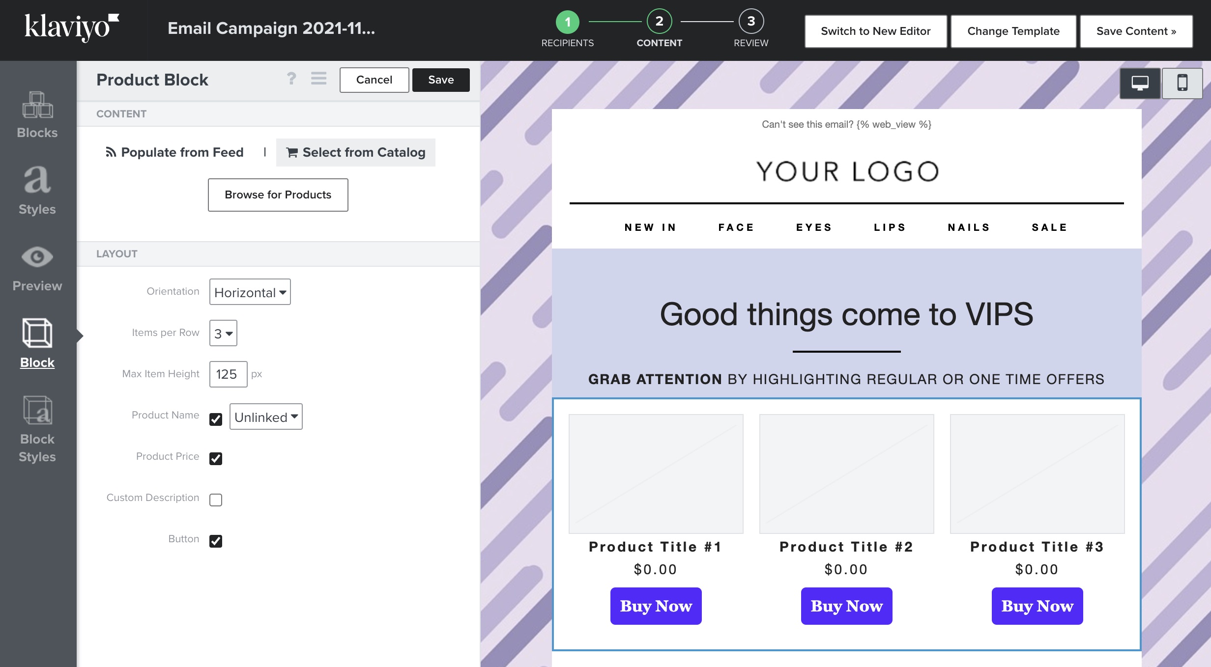
Old empty state for the product block
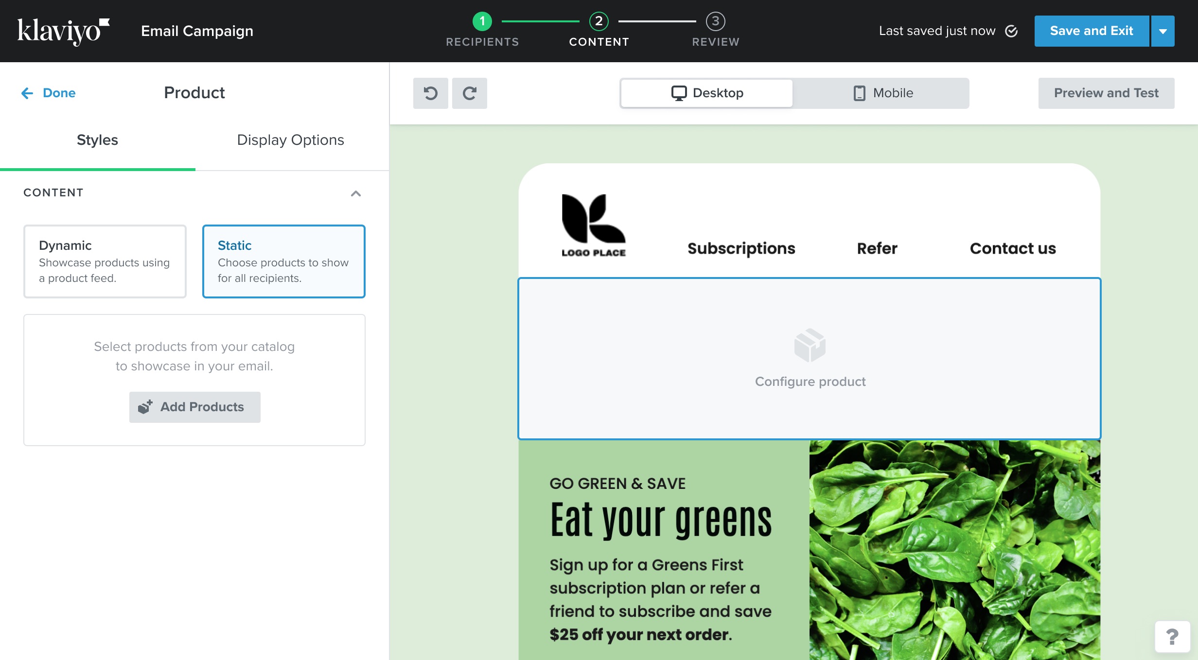
New empty state for the product block
Sections
NEW FUNCTIONALITY
Frequently, users create compositions using several content blocks.
Sections simplify this process by enabling users to group multiple blocks in a single area that can be easily moved.
Sections demanded new ways to communicate how items being added would be part of an existing section or included as a standalone block.
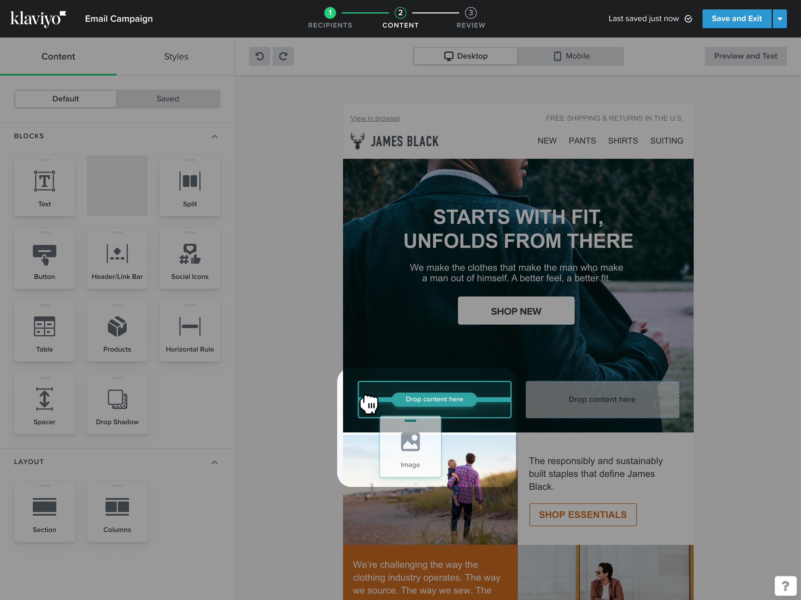
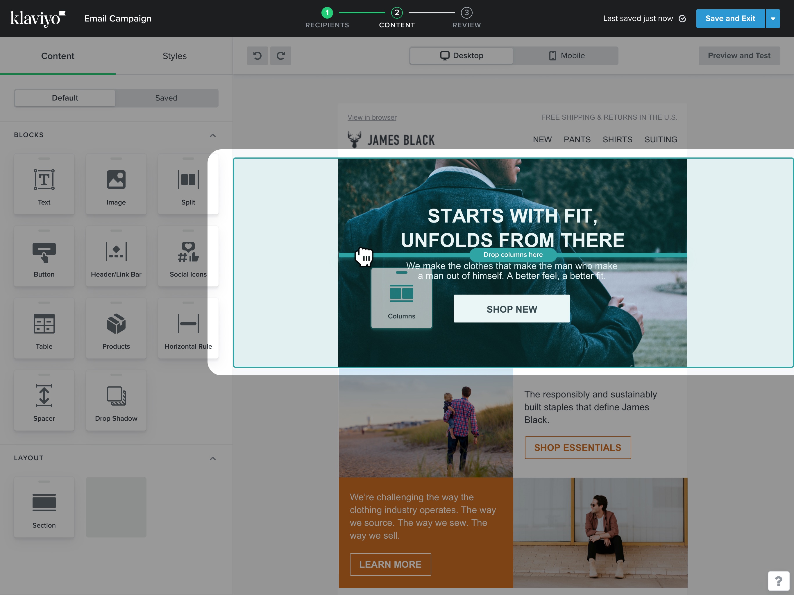
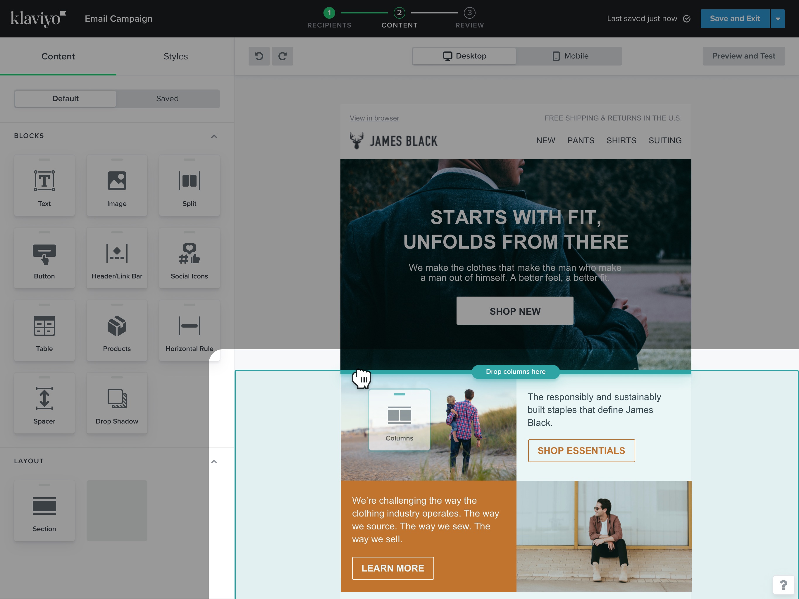
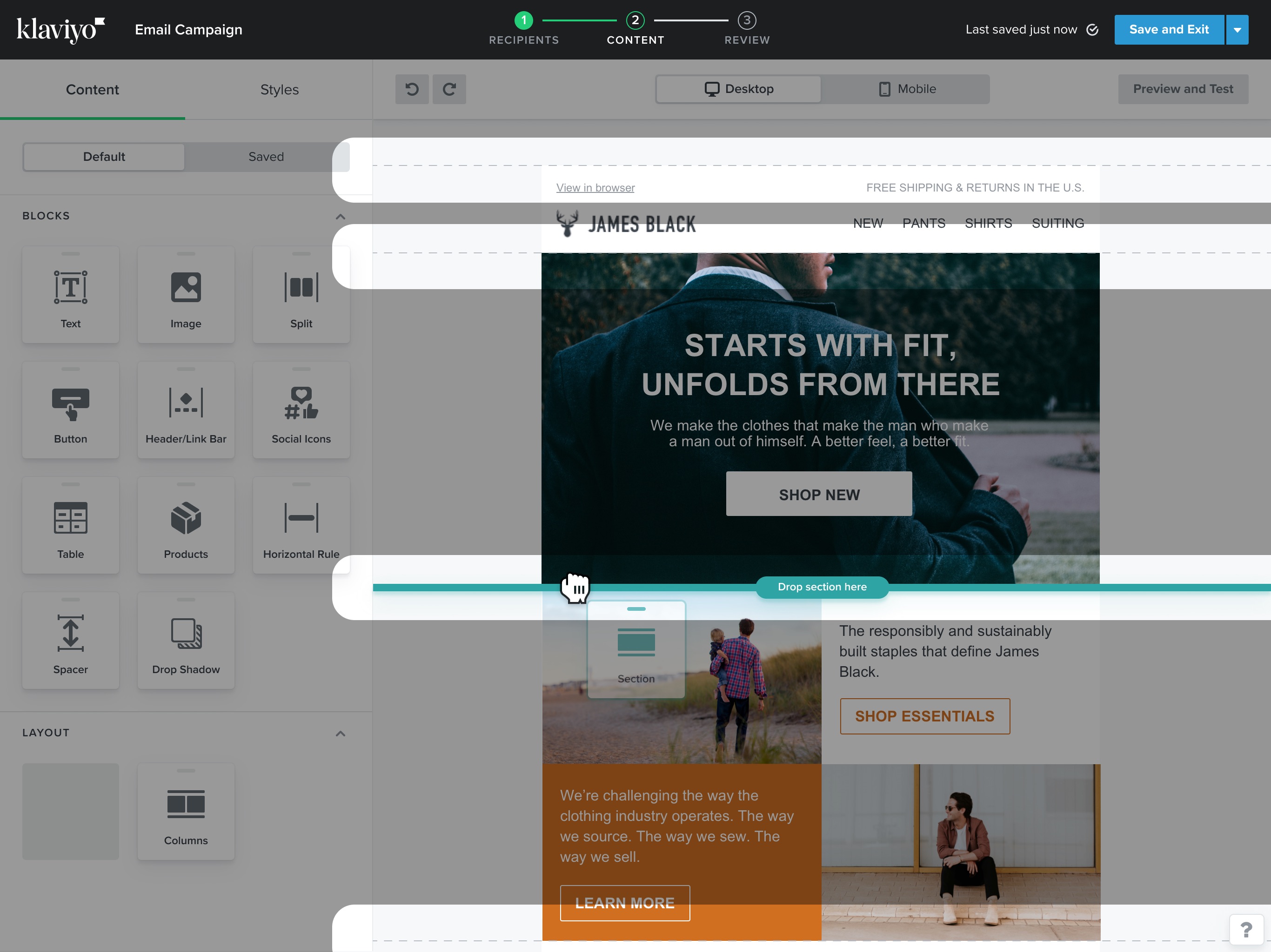
As users hover on the canvas with a block selected, highlighted areas give feedback about where the content would be added to.
When adding a section, “dropzones” are highlighted on the canvas, giving users control and visibility.
Builder migration
CONVERSION STRATEGY
I worked with product and content teams on the release strategy of the new email editor.
This included ways to promote the new editor to users, and the workflow to convert messages made in the classic editor to the old one.
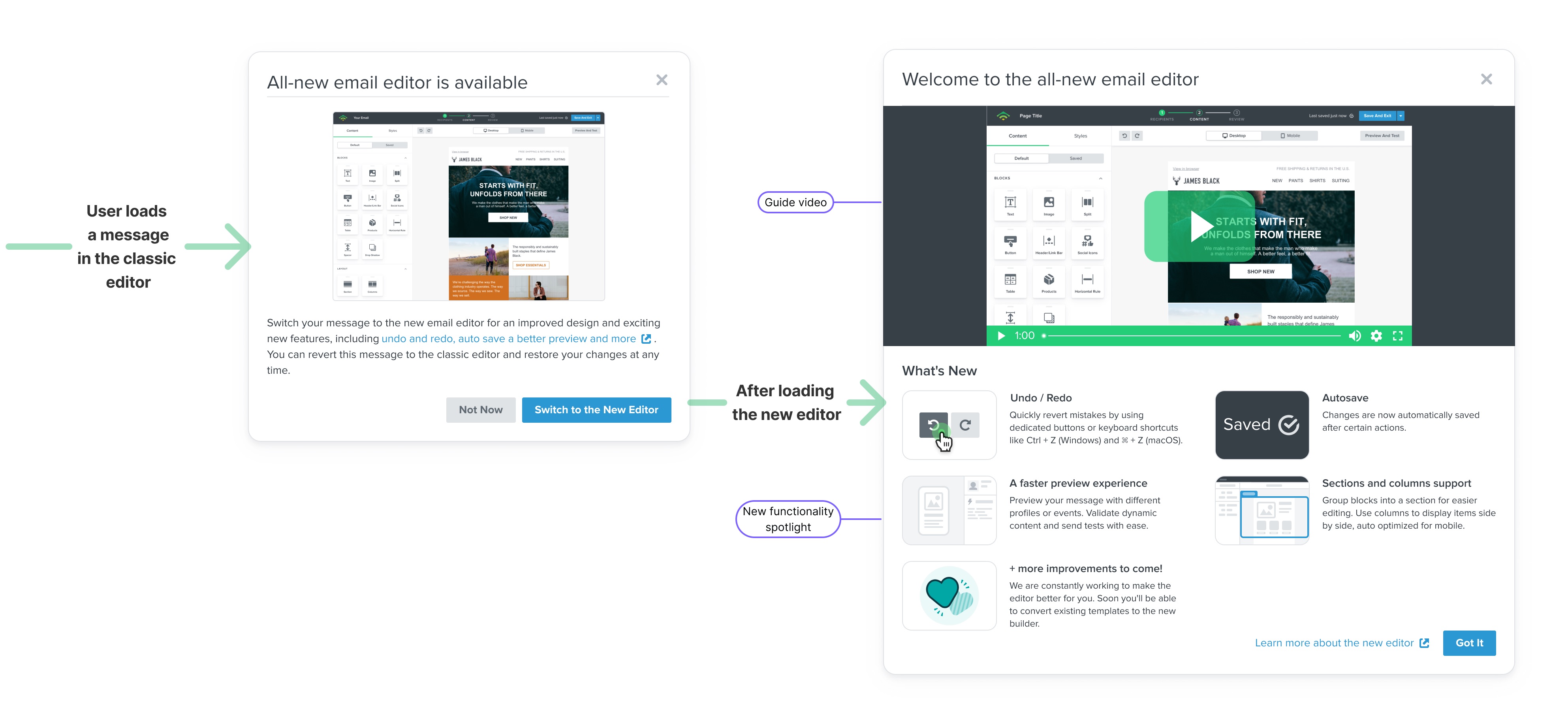
Initially, as we were ironing out some bugs, the new email editor was opt-in.
We wanted to ensure users had control to revert to the classic editor and we could collect feedback from those that tried the new experience and decided it wasn't for them.
After converting to the new experience, a modal highlights key new builder features to onboard users to the new editor.
This was suggested as a new pattern that other teams could use as part of our design system.
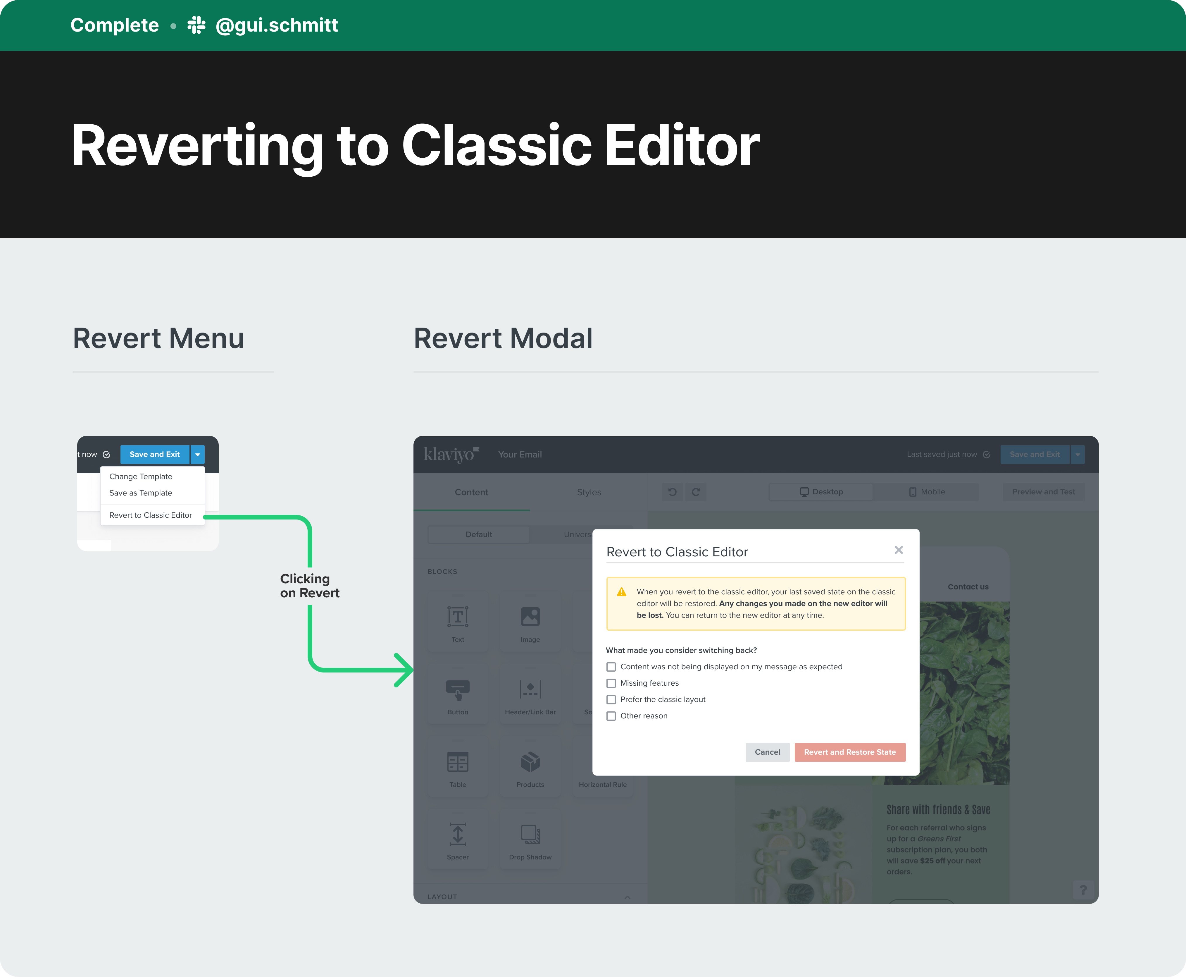
During the opt-in period, users could also choose to revert to the classic editor.
We used this as an opportunity to collect feedback on what to improve to ensure the new experience met users expectations before automatically switching all users over (which happened in mid 2023)
Impact
The new editor was publicly announced as an opt-in experience during Klaviyo's Product Event in late 2021.
“The editor is amazing, I absolutely love Sections - it is a game changer. The Background Image feature is great. Stacking of content in sections saves a lot of time."
-- Customer feedback
“I love the template builder and pre-built flows. Both features are huge for enabling small and agile teams to create and share their messages."
-- Loretta Doria, Head of Strategy, Ragnarok
“The email builder tool - best WYSIWYG tool out there for building emails! Combined with the ability to preview with live data, it's a powerful tool for combining design and functionality"
-- René Fielder, President Agency Services, The Grit Group
If you aren’t using the new Klaviyo editor… what are you even doing?
— Elliot Scott (@TheElliotScott) September 28, 2022
Not sure if I am late to see this but love the new template editor from @klaviyo
— Abhisheek (@AbhisheekPatra) November 5, 2021
It is way more clearer and the best part is that we have no the redo and undo buttons (arrows).
Another hidden gem is the "Preview and Test" - now we can use events right from within the template. pic.twitter.com/8QqOyeBIAX
Lovin’ the new template editor @klaviyo #EmailMarketing #EMAIL #Emailtemplate pic.twitter.com/ULhaL9cbxr
— Rosemary Marcelino (@rose_creates18) August 5, 2022
One of the best things about Klaviyo's new editor is the new table builder
— jacob sappington (@jsappington) September 23, 2022
IYKYK
The masterful @klaviyo strikes again! The new editor incorporates all of the feedback I've given when asked about my experience and has taken what was already the dream tool, to the next level. Great work.
— Sarah Kemp (@SarahHMuir) October 10, 2022
With the new editor as a foundation, we focused on the next suite of requested features, including better dynamic content handling and universal blocks.
Extra
I had the opportunity to talk more about the process of designing the new email builder on Klaviyo's Medium page →

links & hobbies
links & hobbies
links & hobbies
links & hobbies
links & hobbies
Photography ∙ Playlists ∙ Films
hey, thanks for visiting
hey, thanks for visiting
hey, thanks for visiting
hey, thanks for visiting
hey, thanks for visiting
have a nice day
have a nice day
have a nice day
have a nice day
have a nice day
PIXELS POLISHED WITH ♥, BY GUI ∙ LAST UPDATED EARLY 2023